|
February so far has mostly just been hand practice for me, because I noticed I was having trouble with them on another drawing so I decided to crunch down on them. I also finished the Evil Dead print I was working on, which was new for me since I hadn't done the big linoleum blocks before so I had a little trouble carving them at first. I also had to print on black paper because I wanted the lines to be black but I only realized I messed my carving up a few minutes after I started and you can't just put back what you carved away.
For my hand practice, I've been using a website called Line of Action that has a timed hand/feet practice section, and doing 2 minutes for each hand.. https://line-of-action.com/practice-tools/hands-feet-practice/
0 Comments
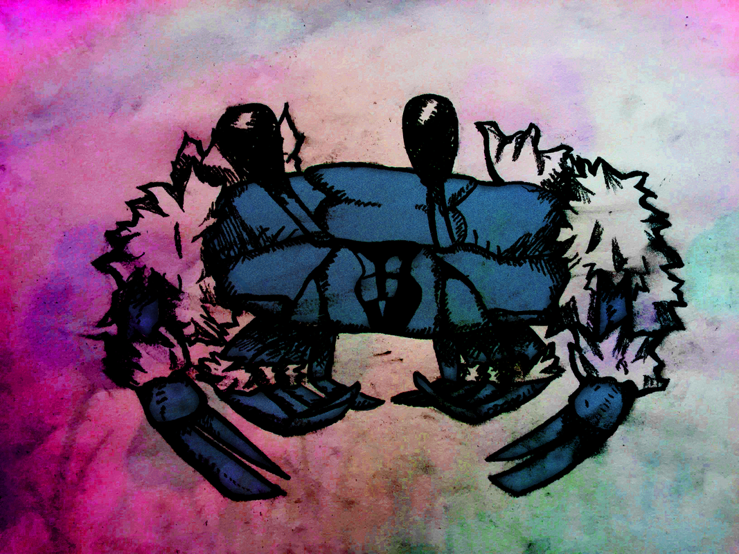
My art has still been focused on improving poses, this time using a wooden doll for some of it, and finishing up the Power Ranger drawn the other month. Artistic behaviors; I've been getting better at acknowledging when something is too static, and where things should go as well as being more conscious of varying my line thickness and quality. Initially the lines were thinner on the ranger but I thickened them later after some advice from Mrs. Haggerty. I used oil pastels for the power ranger picture, and I think they turned out pretty well-- it was my first time using them. The images on lined paper are just character practice during classes where I didn't have my sketchbook while the last one is the print making project I'm working on, where I'm doing the poster of a movie I really liked. Most of my work over the past month has been focused around the figure/pose drawing element of the class, and so all of the pictures will be about those in this post. I had initial drawings for what I wanted to do and was about to finish it there, but I then received some helpful criticism about how my poses looked too static/lifeless, so I doubled down on pose drawings, using quickposes.com and doing several minute-long (later 2-3 minutes because 1 minute isn't enough for someone of my skill level) costumed pose practices. This is good for me because my eventual concentration I'm hoping will be focused around those sorts of things- fun, dynamic character poses, and the like. I thought the complaint piece was a nice way to try to conceptualize something that you can't really have a physical form for (unless your complaint was physical) and that it encouraged creativity and speaking out about what you want to speak out about. My complaint piece was supposed to convey the "poisoning" of certain things by other people's dirty hands, but I'm not so sure that the message got across very well. I could have put some text on the sphere but that would've just made it look almost like a political cartoon, which I'm not too fond of. The process started from just one hand to being two hands as well as the forearms, for better "framing" of the picture, and more content. The calligraphy pen introduction I don't really have a lot to say about. It was just an introduction, I did some doodles, I'm not new to calligraphy pen stuff. The never seen never will piece was also a nice way to try to conceptualize unseeable things, it is somewhat similar to the complaint piece in that you're trying to give form to something that you can't really physically touch (again, unless your subject was real). I didn't do that though, I picked something real and tried to think about what it would look like. I picked a fur-covered crab and thought about where its fur would be, why it would need fur, etc. and drew it out. I thought it was a nice way to experiment with charcoal pencils and digital image editing on my end, as you can tell from the various glamour that the finished product has. My end result didn't look too similar to an actual fur covered crab when I looked at one afterwards, but oh well.  First picture: 10 minute color pencil piece
Second, third pictures: Never seen, never will piece (colored ver. coming up soon) Fourth: Calligraphy pen introduction Fifth, sixth, seventh: Complaint piece  This was an interesting project to work on. It was a value study, but not necessarily in the ways that I had done it before, which was usually drawing from 3 dimensional objects in life. It wasn't just a value study either, it was also a collaboration project for everyone to make a whole art piece out of multiple different individual pieces. I had a few issues with it, such as not being confident enough to try and get certain parts of the piece darker such as the bull's skin. Lack of confidence wasn't really my issue with the near-pitch black part of the piece, I had tried applying the 4B pencil very, very liberally and smearing it all over with the tortillion but it ended up in the same manner as it was with the 2B pencil. One part I did appreciate of the project was my re-discovery of the tortillions, I had forgotten how nice they could be to use.
As for the task party, I don't really remember how it went. I thought it was a nice icebreaker to start the year off, but not really much more than that. I can't really say anything for the summer work review aside from that the sticky note critiquing idea is a good one to put in action, and that I am deeply ashamed at forgetting my own sketchbook in the morning multiple times. 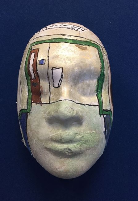 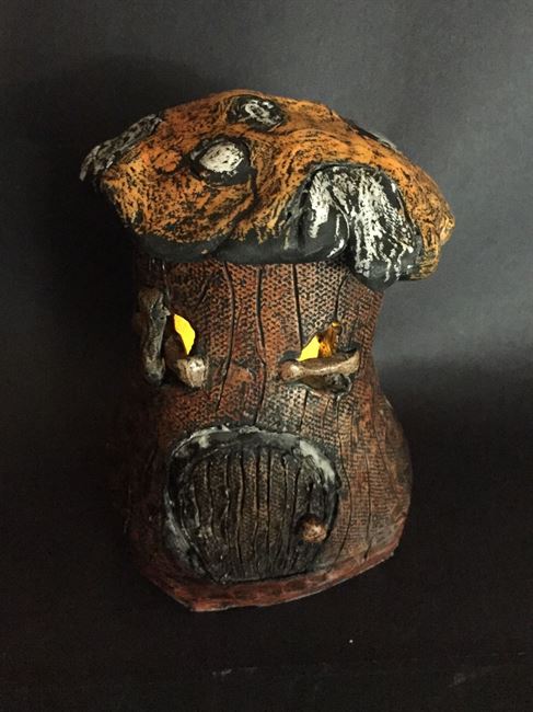 The fairy house was formed out of clay, then left out to dry until it could be put in the kiln to become bone dry, then it was colored by using crayons on its bone dry form and then going over to the sink and getting a paint brush and covering it in ink, then washing it off under the faucet.
After the ink washing, you usually try to polish it with paper towels or a rag to get excess ink off so that it looks a bit cleaner, but doing that is just up to the preference of the person making it. The mask is just plaster in a mold then painting it however you like it. The painting on mine is a one point perspective of the hallway outside the art room. 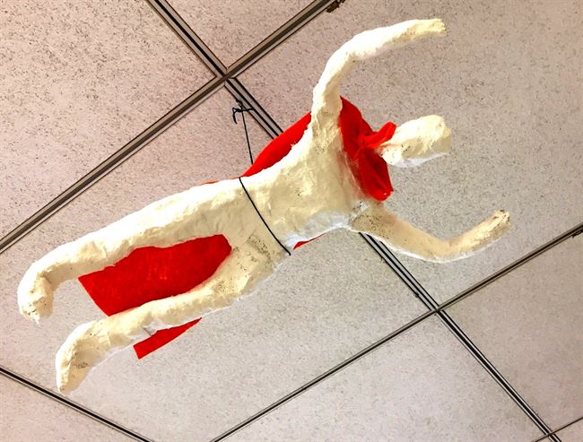 The figure drawing exercise was helpful to getting better at art, and the figure making exercise made me really focus on making it look proportionate/"right". I learned the difference between scale and proportion, the difference being that scale is how big the thing is overall and proportion being how big one thing is compared to another thing.
|
AuthorWrite something about yourself. No need to be fancy, just an overview. Archives
February 2018
Categories |
 RSS Feed
